Creating a brand identity, beginning with logo development for the company 'Kaizen'.
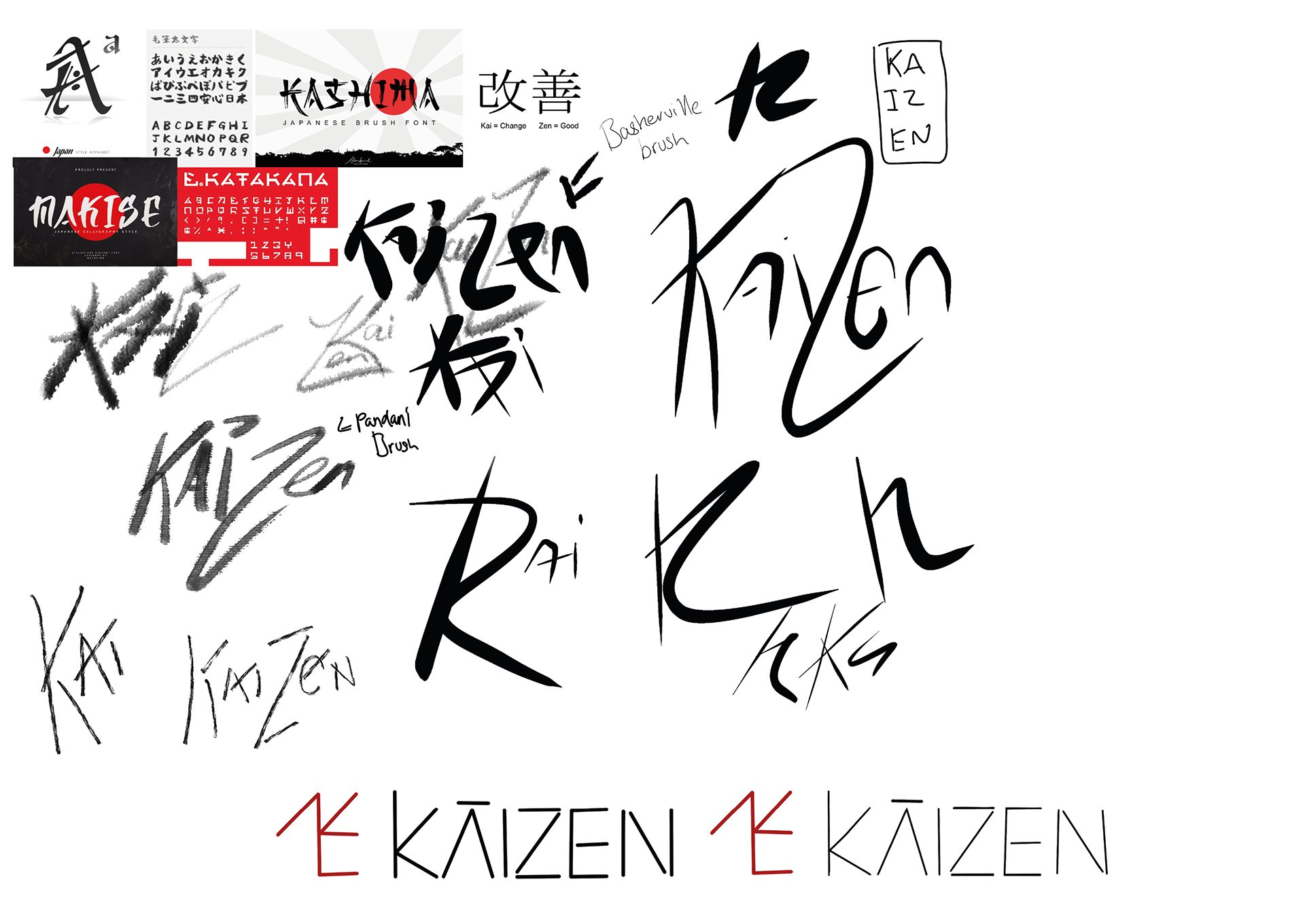
The inspiration for this name originated from the japanese word meaning kai = Change and zen = good.
The company is a virtual personal training company, which will be have a large online presence once completed.


Above is the sketch phase into illustrator files, coming up with concepts and flushing out my ideas.
-
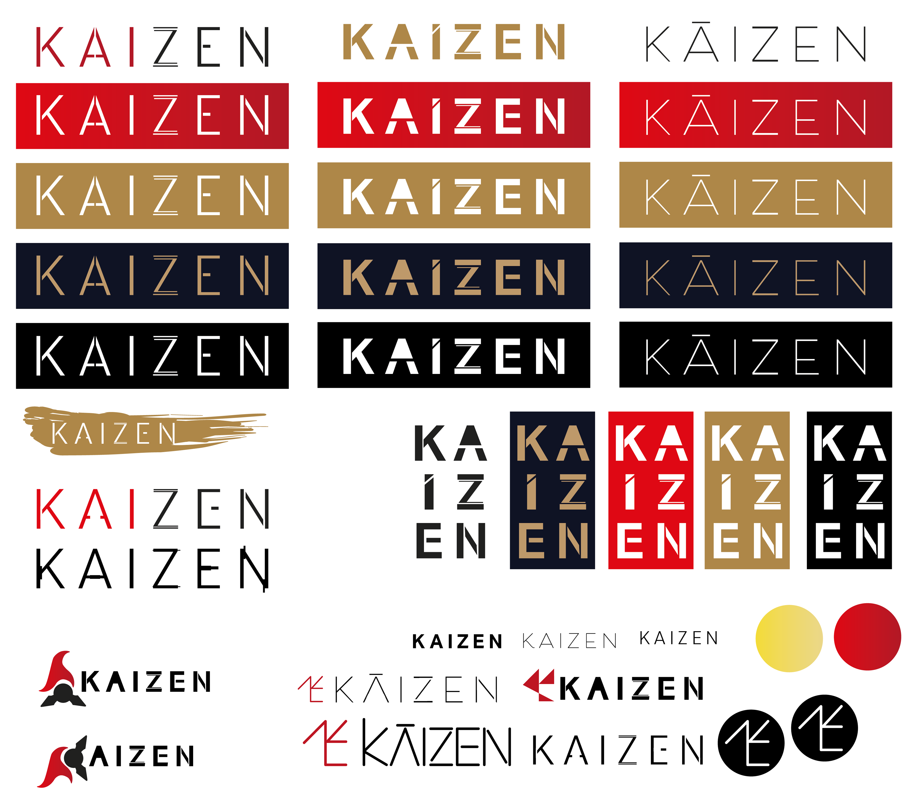
Below is the typefaces created from my sketches and ideas. looking for issues once blown up and how I can push them further.


The final above is the idea I decided to run with, taking inspiration from Japanese sword strikes and bamboo.
-
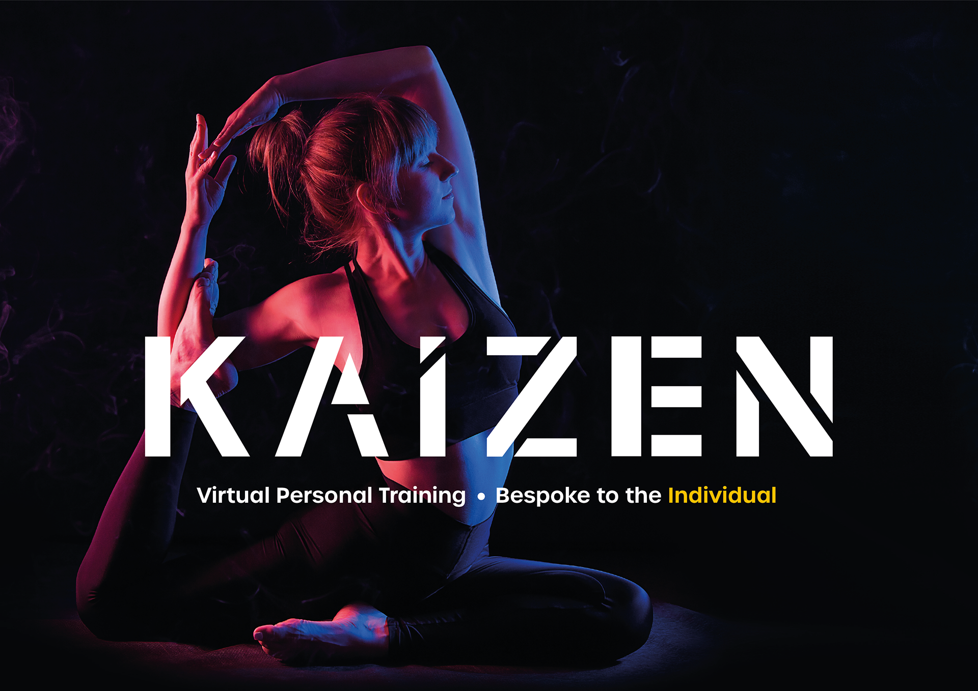
I developed it to the below (black version) fixing spacing issues and keeping it clean & bold.
I developed it to the below (black version) fixing spacing issues and keeping it clean & bold.
-
-


-
