I was tasked with coming up with a brand concept for a PT studio called Clan. Forging the idea of a heartbeat, mixed with the idea of creating a symbol/futuristic piece. This was the outcome.
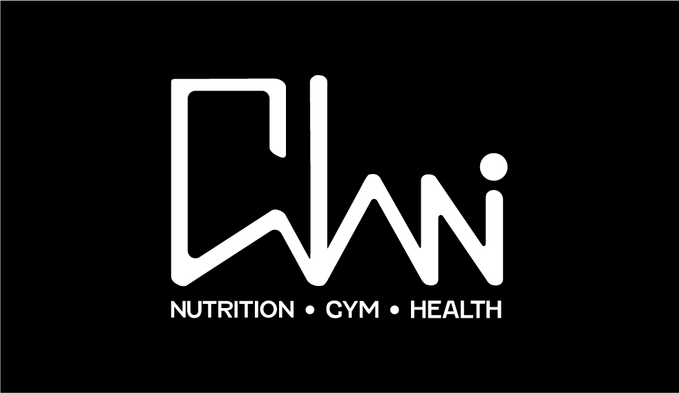
It started with a dot at the end to represent the idea of a person, but it was countering the readability of the 'N' at the end of the word. I then developed it further to become the logo found at the bottom of this page, more readable, futuristic and clean.
-


-
